If you live in Oregon or Washington, you already know the truth about “bright and airy” interiors: they hit different here. Our light is softer. Our winters are long. Our homes lean cozy by default. That means the colors that look perfect on a sunny Pinterest board can land cold, flat, or slightly sad once the PNW clouds move in.
The good news: 2026 color trends are finally catching up to how people actually want their homes to feel. Warm. Grounded. Calm. A little more lived in, less showroom. Designers are moving away from sterile whites and cool grays and leaning into warmer neutrals, earthy tones, and nature inspired color that makes a space feel intentional and inviting.
Below are the 2026 trends we are seeing everywhere, plus timeless choices that still work for resale, and our Bella Vista recommendations for modern PNW homes.
The big shift for 2026: Warmth replaces gray
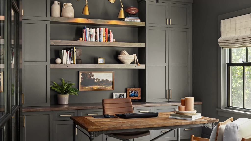
If you feel like you have been living in a gray box since 2017, you are not imagining it. The trend tide is turning. The “new neutrals” of 2026 are warmer, earthier, and more character-driven. Think soft browns, putty tones, khakis, warm sages, and deeper grounding shades like chocolate and charcoal.
This shift is especially helpful in the PNW, where cool gray can read icy under overcast light. Warm neutrals tend to glow more naturally in our climate.
2026 trend color families that work beautifully in PNW homes
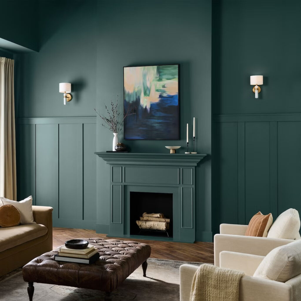
1) Soft browns and espresso neutrals
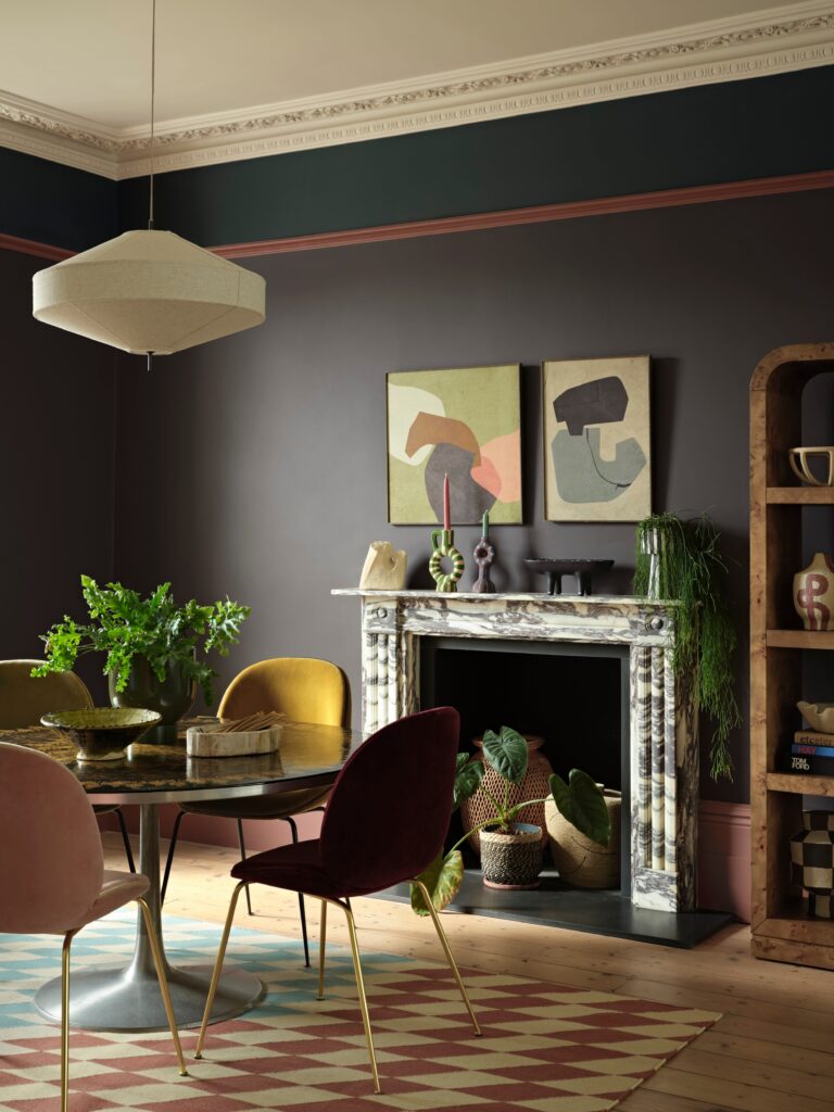
Brown is back, but not in the dated way. 2026 is bringing in refined espresso and soft cocoa tones that read rich, calm, and modern. Benjamin Moore’s 2026 Color of the Year, Silhouette AF-655, is a deep burnt umber with charcoal notes, designed to feel elegant and grounding.
Where it works in the PNW:
- Powder rooms and offices (moody, grown up, cozy)
- Dining rooms (warm, elevated)
- Accent walls behind wood shelving or art
- Lower cabinets paired with warm white uppers
Bella Vista tip: Deep browns love warm trim. Pair with a creamy off white instead of a crisp bright white to avoid harsh contrast.
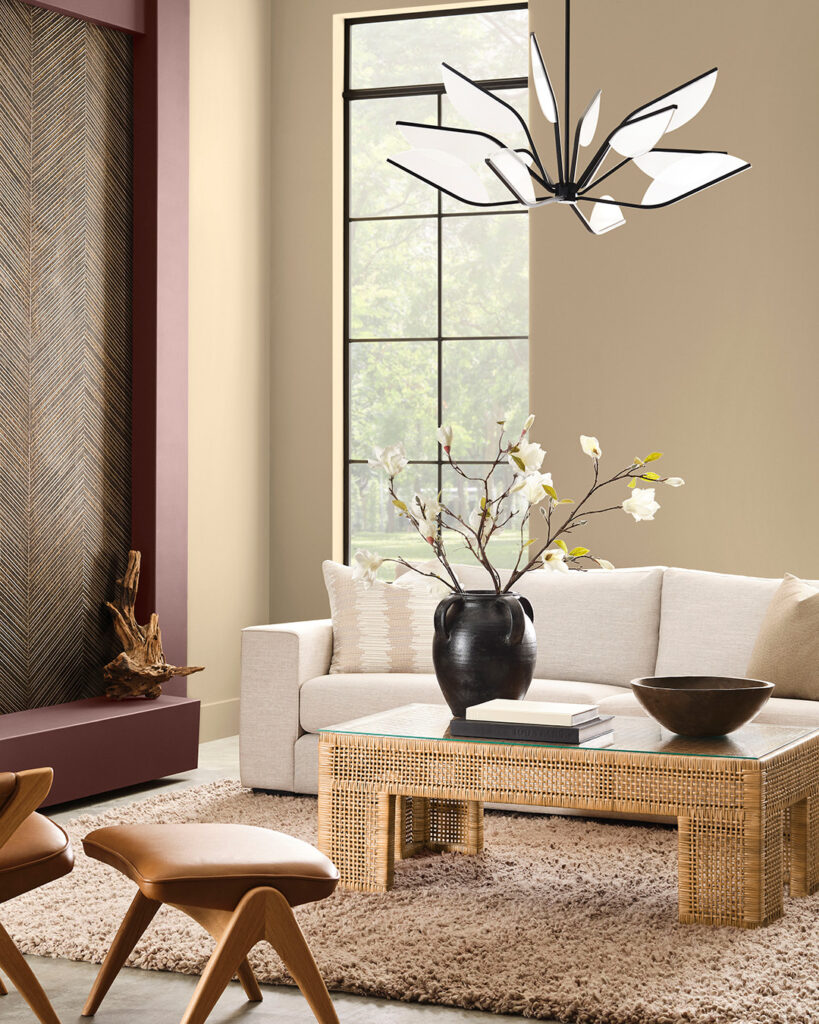
2) Khaki, putty, and warm greige
These are the neutrals buyers tend to respond to because they feel clean without feeling cold. Sherwin-Williams selected Universal Khaki SW 6150 as its 2026 Color of the Year, and it fits the broader shift toward livable, warm neutrals.
Where it works:
- Whole home refreshes
- Open concept living spaces
- Hallways and stairwells that need warmth
- Rental properties and listing prep
Bella Vista tip: If you want a neutral that photographs well on gray days, warm greige and khaki tones usually beat cool gray in the PNW.
3) Nature greens, from sage to smoky jade
Greens are still going strong, but 2026 greens are warmer and more grounded. The Behr 2026 Color of the Year, Hidden Gem, is a smoky jade that sits between blue and green. It gives you color without screaming for attention.
Where it works:
- Bedrooms (calm, restorative)
- Entryways (instant character)
- Kitchen islands (modern, earthy)
- Laundry rooms and mudrooms (fresh and intentional)
Bella Vista tip: In homes with lots of fir, oak, or cedar, green is a cheat code. It plays beautifully with wood tones and makes the whole space feel more “PNW on purpose.”
4) Clay, terracotta, and sun warmed rust
Earthy reds and clay tones are showing up everywhere in 2026, including trends like color drenching and bolder applications of warm, grounding color.
Where it works:
- Dining rooms and reading nooks
- Arched doorways, built ins, or a single statement wall
- Mid century modern homes that can handle warmth
Bella Vista tip: These tones look incredible with warm whites, matte black fixtures, and natural textures like jute, linen, and walnut.
5) Soft yellows and “butter” warmth
Yellow is creeping back in, but in a softer, buttery way, not neon. Designers are calling out yellows as mood-lifting accents and warm statement pieces in 2026.
Where it works:
- Kitchens and breakfast nooks
- North-facing rooms that need help feeling sunny
- Kid spaces, but make it elevated
Bella Vista tip: If you are nervous, start with a buttery neutral on the walls and bring stronger yellow through decor. You still get the warmth without committing to full mustard walls.
Two big style moves for 2026: Color drenching and color capping
Color drenching
This is the “paint it all” look: walls, trim, doors, sometimes even the ceiling in one color family. It creates a cocoon effect and looks especially high end when done with clean lines and intentional sheen choices.
Best rooms for color drenching:
- Offices
- Powder rooms
- Bedrooms
- Smaller spaces where a bold move feels designed, not chaotic
Color capping
Color capping is when you paint the ceiling a color (sometimes the top portion of the wall too) to create warmth and architectural interest. It is a great move for PNW homes with lower winter light because it adds depth without needing intense saturation.
Best rooms for color capping:
- Living rooms with simple box ceilings
- Hallways
- Bedrooms with minimal crown detail
Timeless choices that still feel current in 2026
Not everyone wants a trend moment, especially if you are thinking resale in the next few years. Here are the “safe but not boring” choices that work consistently in modern PNW homes:
- Warm whites (creamy, not stark)
- Soft greige and putty neutrals
- Muted warm sages
- Blue greens with a gray green undertone
- Charcoal used sparingly for contrast
A quick note on finish, because it changes everything
A beautiful color can look wrong if the sheen is wrong. Gloss on large walls can highlight every bump and patch. Matte can feel dreamy in low traffic rooms, but it is not always practical for busy hallways with kids and pets.
If you want a simple baseline:
- Walls: eggshell or satin in most living spaces
- Trim: satin or semi gloss
- Bathrooms and kitchens: pick finishes that handle moisture and wipe clean
If you are not sure, we can help you choose a finish that matches how your home actually functions.
The easiest way to choose the right 2026 color for your home
Instead of chasing a color that looks trendy online, ask these three questions:
- What direction does the room face, and how much natural light do you get in winter?
- Do you want this to feel calm, cozy, bright, or dramatic?
- Is this a “for us” choice, or a “we might sell” choice?
That is how you get a home that feels good now and still makes sense later.
Ready for a 2026 refresh?
If you are planning an interior paint project for the new year, this is the perfect time to map it out. Color selection, finish choice, and prep planning now makes the entire project smoother once you are ready to schedule.Want help choosing a palette that works in PNW light and fits your home style?
Claim your free online quote and we will help you build a plan that feels modern, timeless, and genuinely livable.