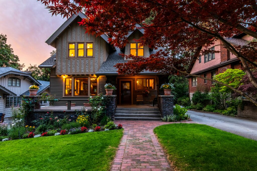
If you own a classic home in Portland or Vancouver, you already know the struggle: you want it to feel fresh and modern, but you do not want to accidentally erase everything that makes it special.
And in the Pacific Northwest, paint choices feel higher stakes. Our light is softer and grayer. Our winters are damp. Our summers can suddenly blast a west-facing wall with intense sun. The wrong color or finish can look “off” fast, and the wrong prep can turn a simple repaint into peeling, mildew, and expensive repairs.
This guide is for the historic homeowners who love their house’s character but do not want to live in a museum. We are going to talk about how to pick colors that respect the architecture, still feel current, and actually hold up in the PNW.
First, A Quick Note On “Historic” In Portland And Vancouver
Before you fall in love with a color palette, take two minutes to check whether your home has any historic designation or review requirements.
In Portland, some properties are Historic and Conservation landmarks or sit within historic districts, and certain exterior changes visible from the street can require Historic Resource Review.
In Vancouver, there are neighborhoods with recognized historic significance, like parts of the Hough neighborhood, which is listed on the Washington Heritage Register.
What does that mean for color? It varies, but a common theme in preservation guidance is that most colors can work when they fit the building and the block, and ultra-bright, fluorescent, and harsh primary colors are usually discouraged on large surfaces.
If you are not sure, a quick call or check-in with local guidelines can save you a headache later.
Why Classic Pnw Homes Look Different Than They Do On Pinterest
Portland and Vancouver homes live under a particular kind of light. We get long stretches of overcast days, lots of shade from mature trees, and then sudden direct sun on the south and west sides.
That affects color in three big ways:
- Cool colors can feel cooler. A crisp white that looks clean in Arizona can look icy in a Portland winter.
- Deep colors can go flat in shade. Some trendy dark paints lose dimension when the light is muted.
- Warm neutrals are your safest “modern” move. Soft warm whites, gentle greiges, muted taupes, and earthy tones tend to look good in both cloudy light and sunshine.
If you want your home to feel modern without fighting the PNW, aim for colors with a little warmth or softness baked in.
Start With Your House Style (It Is Trying To Help You)
A lot of color regret comes from picking a palette that ignores the architecture. Your home already has clues: roofline, trim thickness, window style, porch details, and materials.
Here is how we approach the most common Portland and Vancouver styles.
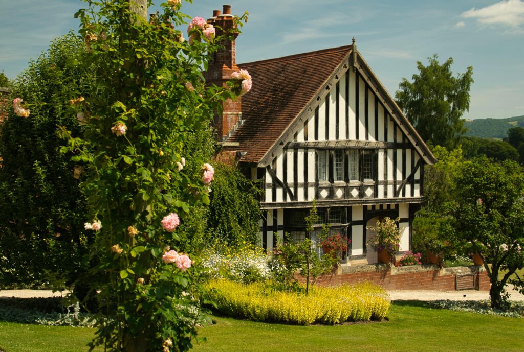
- Victorian And Queen Anne
“LET THE DETAILS BE THE DRAMA”
Victorians have ornate trim, decorative brackets, patterned shingles, and layered surfaces. They can handle more color, but the best-looking schemes usually have a plan.
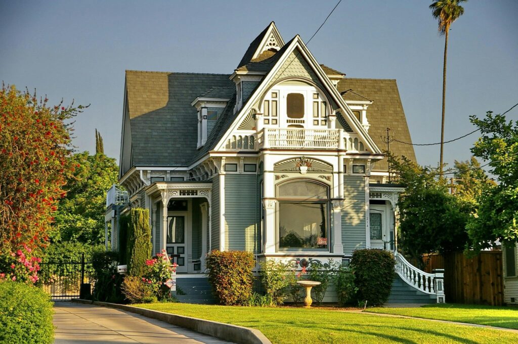
What works (modern but respectful):
- Body: muted jewel tones (dusty teal, deep sage, smoky blue, warm charcoal)
- Trim: warm cream or soft off-white (not a stark bright white)
- Accents: one darker anchor color for doors, sash, or small details (oxblood, deep navy, dark green)
Common mistake: going too bright or too contrast-heavy so the house feels costume-y. The goal is “elevated historic,” not “theme house.”
PNW tip: If your home sits under heavy tree cover, choose a body color with enough depth that it will not look washed out in shade.
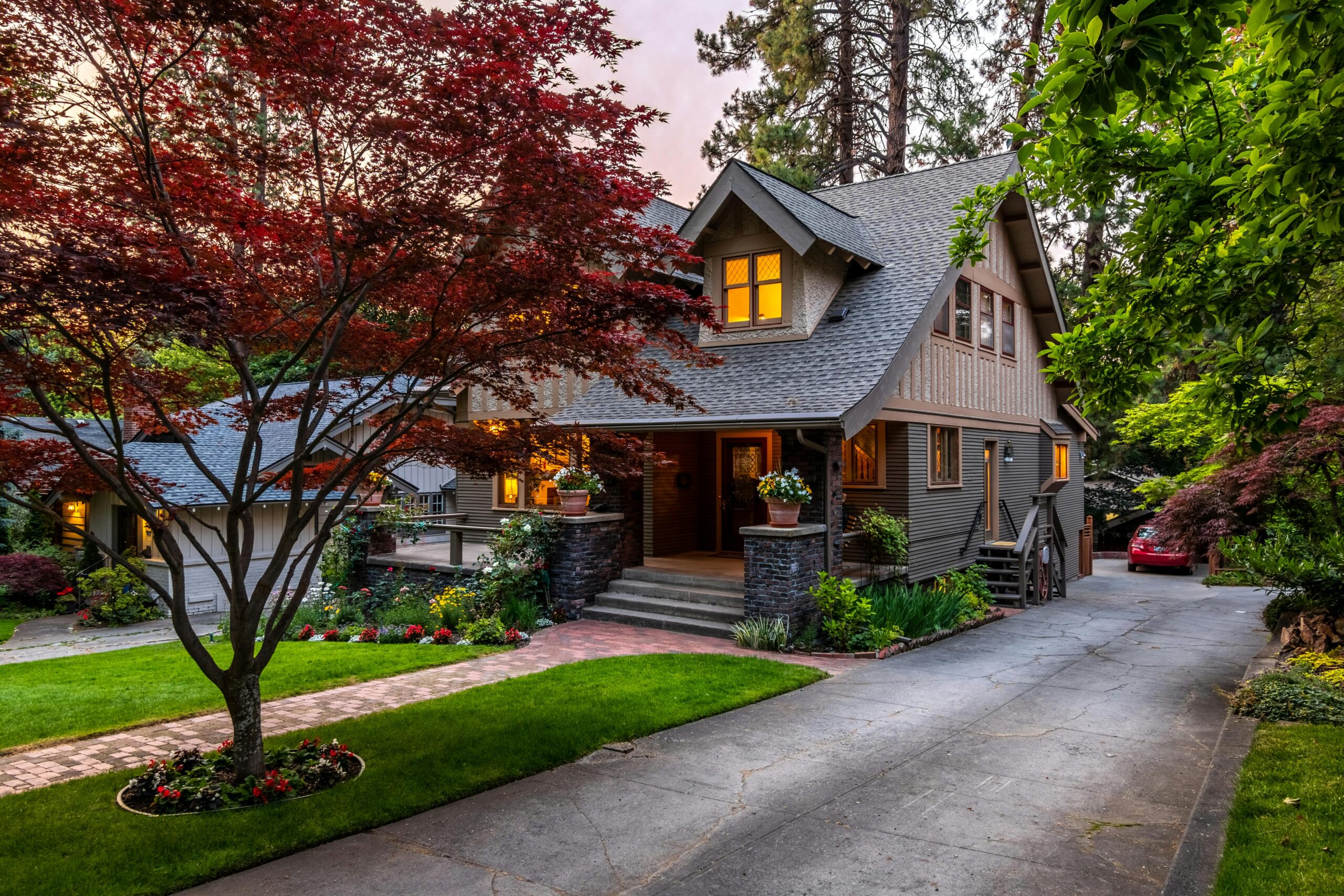
- Craftsman And Bungalow
“EARTHY, GROUNDED, AND A LITTLE MOODY”
Craftsman homes are everywhere in Portland, and for good reason. They were built to feel warm and sturdy, with strong trim lines and natural materials.
What works:
- Body: olive, moss, warm taupe, deep clay, muted blue-gray
- Trim: soft warm cream, light greige, or a lighter version of the body color
- Accents: a darker trim or door color that feels grounded (espresso, deep green, charcoal)
Common mistake: choosing a trendy pale gray that fights the warmth of the wood and stone details. Many Craftsman homes look best when the palette leans natural and slightly warm.
PNW tip: If you want modern, keep the scheme simple: fewer colors, cleaner contrast, and a confident front door.
- Tudor And English Cottage
“KEEP IT SOFT, NOT SHINY”
Tudors often have mixed materials: stucco, brick, stone, and dark trim details.
What works:
- Stucco: warm off-white, creamy beige, soft putty
- Trim: deep brown, charcoal, or near-black (matte or low sheen looks best)
- Door: classic stained wood or a muted heritage color (deep green, navy)
Common mistake: using a glossy finish on large areas or picking a bright white stucco that makes everything feel harsh in gray winter light.
Material note: If you have brick or stone, be cautious about painting it. Historic masonry needs to breathe, and the wrong coating can trap moisture.
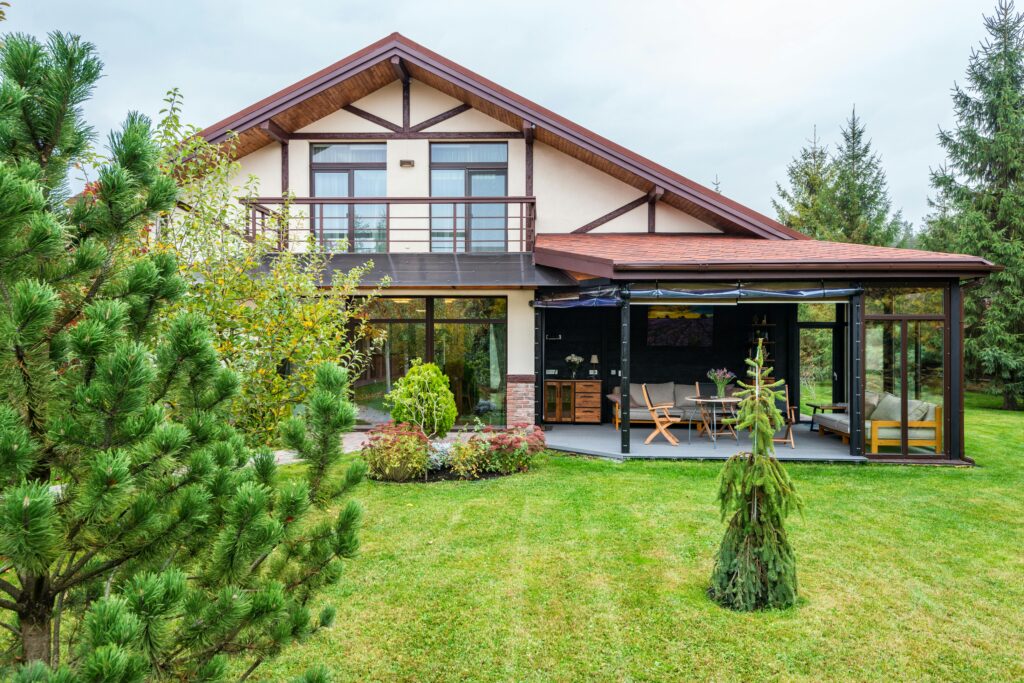
- Mid-Century And Ranch
“CLEAN LINES, LOW CONTRAST, STRONG ACCENTS”
Mid-century homes usually look best when the palette supports the architecture instead of overpowering it.
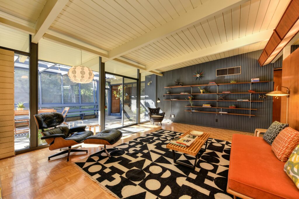
What works:
- Body: warm white, soft greige, muted charcoal, or a subtle green-gray
- Trim: often minimal, sometimes the same color as the body for a sleek look
- Accents: a single bold moment (front door, siding panel, or garage) in a controlled color like deep teal, rust, or ochre
Common mistake: over-trimming and over-contrasting. Mid-century design loves restraint.
PNW tip: If you have cedar or wood siding, consider how stain and paint will interact. Sometimes the most modern look is painted body with natural wood accents.
“Historic” Does Not Have To Mean “Old-Fashioned”
Modernizing a historic exterior is usually less about chasing a trend and more about these three moves:
- Choose a calmer palette. Muted, earthy, and warm-leaning colors feel updated without looking out of place.
- Simplify the color count. Two colors plus a door is often enough. Many older homes look instantly more modern with fewer competing accents.
- Use the trim strategically. Trim is your architecture highlighter. Decide what you want to emphasize: windows, brackets, porch columns, or none of the above.
If you want it to feel current, focus on cohesion, not complexity.
Common Painting Mistakes We See On Portland And Vancouver Historic Homes
1) Choosing a dark color without thinking about sun exposure
South and west sides take a beating in our region. Dark paint absorbs more heat, stresses the surface, and shows fading faster. If you want a dark house, you can absolutely do it, but product choice and prep matter more, and you should expect more maintenance over time.
2) Picking the right color but the wrong finish
High gloss looks tempting because it is “wipeable,” but on older walls it can highlight every bump, seam, and patch. Most historic interiors and many exteriors look best in low-sheen finishes that hide imperfections and feel more natural.
3) Skipping moisture fixes because “we are just painting”
If you have peeling, soft wood, recurring mildew, or bubbling paint, the paint is not the problem. Water is. Gutters, splashback, failing caulk, roofline drips, or poor ventilation can all sabotage your new paint job.
4) Painting over failing layers
A lot of historic homes have multiple generations of paint. If old layers are peeling or chalky, painting over them can cause early failure. Good prep is not glamorous, but it is the whole job.
5) Not considering lead-safe work in older homes
Many homes built before 1978 may have lead-based paint. If paint will be disturbed, there are specific lead-safe requirements for paid contractors under EPA rules, and Oregon and Washington both have programs around certification and compliance. This matters for your family, your pets, and your neighbors, especially when scraping or sanding.
A Simple Color-Picking Process That Works In The Pnw
If you want a plan that reduces second-guessing, do this:
- Walk the house at three times: morning, mid-day, and late afternoon. Note where shade sits and where sun hits hard.
- Identify what cannot change easily: roof color, brick, stone, stained wood, and hardscape. Your paint should complement these, not fight them.
- Pick one of these “safe” directions for PNW historic homes:
- warm white and soft black accents
- earthy green with creamy trim
- muted blue-gray with warm white trim
- soft greige with charcoal accents
- Test with sample boards, not just swatches. Paint a couple of boards and move them around the house. Cloudy day and sunny day both matter here.
- Decide your trim strategy: highlight it (classic) or soften it (modern). Either can work, but mixing the two usually looks accidental.
When In Doubt, Think Like A Buyer (Even If You Are Not Selling)
Most people do not want “trendy.” They want “well cared for.” A cohesive, climate-smart paint job signals:
- this house has been maintained
- moisture has been managed
- the exterior is protected
- the home will not immediately need a big project
That is true whether you are planning to sell soon or staying put for the next decade.
Final Thoughts
Choosing paint for a historic Portland or Vancouver home is not about finding the one perfect color. It is about choosing a palette that fits the architecture, looks good in PNW light, and is supported by prep that can survive our weather.
If you want a second set of eyes, Bella Vista can help you build a plan that feels modern, respects your home’s character, and holds up season after season.
If you are ready, claim your free quote and we will take it from there.