
Open-concept homes look easy to paint right up until you have to pick the paint.
You stand in the kitchen and you can see the dining area, the living room, the entry, the stairs, and roughly twelve walls from one spot without turning your head. So you do the sensible thing. You grab one safe greige, roll it everywhere, step back, and somehow the kitchen looks warm, the living room looks faintly purple, and the entry looks a little dirty.
Same can of paint. Three different rooms. Cool.
That is the whole puzzle of interior painting in open concept homes around Beaverton, Hillsboro, Lake Oswego, and Vancouver. In an older house, a color only has to behave inside four walls and a door. Here, one color has to hold up across your whole main floor, under totally different light, next to the cabinets and the floors and the fireplace, all at once.
The good news is this is very fixable. It just means thinking about the space a little differently than the room names on the floor plan.
Think in Sightlines, Not Rooms
In a closed-off house you can treat every room as its own thing. Open concept does not give you that. You are almost never looking at just one room, so you cannot really choose a color for just one room.
Stand where you actually stand, at the island, on the couch, in the entry, and notice what is in frame all at once. Those are the surfaces that have to get along.
Two colors can look gorgeous on separate Pinterest boards and still feel like chaos when they are six feet apart in the same open floor plan. Pick for the whole view your eye takes in, not the individual room, and most of the rest of this gets easier.
Why the “Safe Neutral” Turns On You
Back to that greige that went purple. The culprit is almost always undertones plus our PNW light, working together against you.
Every neutral has a quiet undertone hiding under it, a lean toward green, pink, purple, or yellow. You cannot see it on the chip. You absolutely see it on a twenty-foot wall.
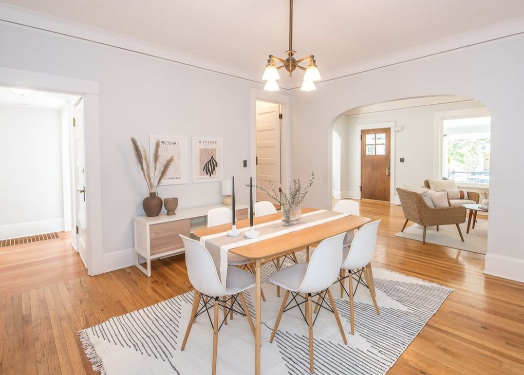
And in an open plan, that one color gets tested by every light source on the floor at the same time, warm kitchen cans, cool gray daylight through a big north window, warm afternoon light in the dining nook. Undertones shift under all of it.
Our PNW light makes this spicier than most places. About 88 percent of Portland’s annual rainfall falls between October and May, which means we spend a lot of the painting year working with softer, overcast light. That cooler light can make some greiges read colder or bring violet and gray undertones forward in ways you might not notice on a paint chip.
The fix is not finding some magical neutral that never changes. It is choosing an undertone that works with your fixed finishes, then testing it everywhere that color actually has to live. We got deep into how PNW gray light messes with color in our blog on brightening dark rooms, and the same principle matters even more in a big open space
You Do Not Need One Color. You Need a Family.
You have heard the usual advice: ‘open concept means paint it all one color.’ It goes a little sideways. One flat color on every wall of a huge space can actually fall flat, especially with tall walls and long uninterrupted runs.
The better move is a small, tight palette that reads as one idea. A main wall color across the connected spaces, maybe a coordinating shade on a feature wall or a tucked-away office, with trim and ceilings tying it together. One family, not one flat coat.
What keeps a family of colors from turning into a free-for-all is the undertone. You do not need everything to be warm or everything to be cool. You just need the undertones to get along. A warm neutral wall can live happily next to black fixtures and a cooler accent, as long as those choices feel intentional instead of accidental. The moment your main wall pulls pink and your floor pulls yellow, you will feel the tension every time two spaces meet, and the bigger the floor plan, the harder that is to unsee.
Not sure how to build a palette that holds together across a whole main floor? That is where we can help. Reach out for a free quote and we can look at the space as a whole before you commit to anything.
Let the Kitchen Make the First Call
People tend to do this one in reverse. They pick a living room color they love, then try to force the kitchen to live with it. In an open home it runs the other way.
Paint is cheap to change. Your cabinets, counters, backsplash, and floors are not, and in most open plans the kitchen is sitting right in the middle of everything you see. So those fixed finishes are where you start, not something you work around later.
Warm wood cabinets and a creamy quartz want a wall family that leans warm with them. Cool gray cabinets and a stark white counter can pick a fight with a warm beige the second it lands next to them. And if you are keeping older cabinets, the right wall undertone can make them read warmer and more intentional, while the wrong one makes the exact same doors look yellowed and dated overnight.
Choose your wall colors with the kitchen standing right there in the room. Never from a chip held up against a blank wall across the house, where it has nothing to answer to.
Where Color Is Actually Allowed to Change
Cohesive does not mean monochrome. You can absolutely use more than one color. The trick is putting the changes where the architecture already gives you a stopping point, instead of forcing one in the middle of a wall just because the floor plan says “dining room” starts there.
A wall that ends at a corner is an easy, natural place to shift tone. A defined dining nook can sometimes carry a deeper shade. An island or a built-in can bring in color without needing another wall color at all. A powder room or an office off the main area is a great spot to go moodier, because it is a little tucked away.
What you want to avoid is a color transition landing in the middle of a continuous wall, where your eye reads it as a mistake rather than a choice. If the architecture does not create a stopping point, the paint usually should not invent one. This is where sightlines come back around: you want to look from one space into the next and feel like the colors are related, even when they are not identical.
Trim, Ceilings, and the Finish Nobody Thinks About
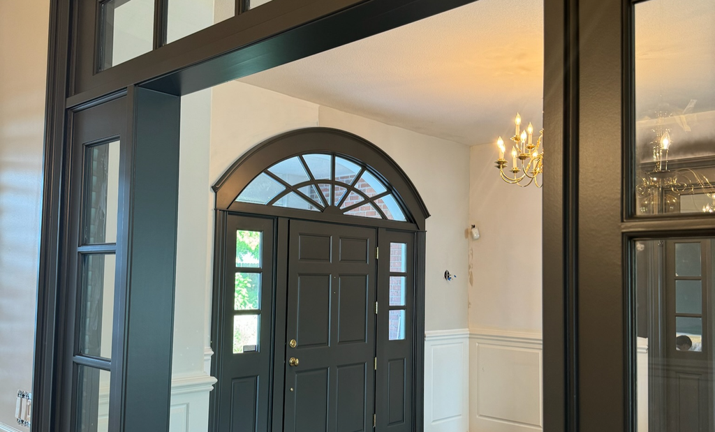
Trim is quietly the most important color on the floor and the one people think about least. Your baseboards, casings, and doors are often the one thing touching every single space, so a consistent trim color works like a thread stitching the whole floor together.
Choose a trim white that works with the undertones in your walls and fixed finishes, then keep it consistent throughout the connected spaces.
Ceilings count too, especially the big vaulted ones you end up staring straight at. A cool builder white can read a little dull or gray against warmer walls, especially under our overcast PNW light. A softer white, or a whisper of the wall color lifted overhead, keeps things feeling bright instead of capping a warm room with a cold lid.
And once the color is right, sheen still matters, because the wrong finish on a long sunlit wall will spotlight every bump. Eggshell and satin earn their keep in open living areas, washable enough for real life without throwing shine across a twenty-foot wall. Not sure which sheen belongs where? We break that down in our guide to matte, satin, and gloss paint finishes.
Test Big, Because Everything Here Is Big
The wrong color in a small bedroom is an annoying weekend. A wrong color across an open main floor and up a two-story wall is an expensive one. So test like it counts.
Paint poster-sized samples and move them around, one by the kitchen window, one on the shaded great-room wall, one up near the top of the stairs where the light changes again. Look in the morning, in the gray middle of a November afternoon, and at night under your actual lamps.
You are not asking “do I like this color.” You are asking “does this color still look like itself everywhere it has to live.” A chip cannot answer that. A big sample on the wall will tell you the truth.
Sometimes the Whole Floor at Once Just Makes Sense
f several connected spaces already need paint, whole home interior painting can make more sense than tackling one open area at a time.
You get to choose the palette as a whole, coordinate the trim and ceilings in one pass, and plan your color changes on purpose instead of discovering them later. You also move furniture and mask floors once, not four separate times, which anyone who has lived through a piecemeal repaint will tell you is worth a lot.
That does not mean every room has to get painted. It just means making each decision with the rest of the view in mind, since in an open home the rest of the view is always right there.
Cohesive Does Not Mean Boring
This is the part we most want you to walk away with. You do not have to paint an open floor plan one shade of beige from the front door to the back wall, and you do not need six colors elbowing each other for attention either. A good palette gives your eye somewhere to rest and still leaves room for a little personality.
Start with the finishes that are staying. Mind the undertones. Test in your actual PNW light. Let the architecture tell you where color is allowed to change.
And honestly, a tall open main floor is where a lot of people decide they would rather not gamble, which is fair. There are vaulted ceilings that are genuinely hard to reach, and one wrong undertone echoes across the entire floor instead of hiding in a spare room.
This is exactly the kind of planning that matters when you are considering interior painting in Beaverton, Hillsboro, Lake Oswego, or working with interior painters in Vancouver, WA. If you are thinking about tackling several connected spaces at once, you can also peek at our interior pricing before reaching out.
Whatever your style, good interior painting in open concept homes comes down to the same handful of moves. So if you are standing in a big open space hunting for one color that works everywhere, claim your free quote.
~Ashley & Crew!!
